Build a Personal Website With Astro and Tailwind
Creating a personal website
Before jumping in to code I would like to talk about what a personal website is and what features we want it to have. A personal website is a place where you can tell the world about yourself. You can show off who you are and what you are good at. It’s a great place to have for many reasons. I created my site to have a place to write about things I find interesting. With a long term goal to teach and inspire others. The biggest advantage of having your own site and blog is to learn. You can explore new tech and write about it. By writing and teaching others you will increase your own knowledge so much more.
In this tutorial we will create the most basic version of a personal website.
What is Astro?
Astro is a web framework that enables you to build fast websites with zero JavaScript as default. Astro has a great developer experience with ready to use themes, plugins and components. They recently released version 1.0 and has been growing in popularity since. For me Astro brings things back to basics but with great developer experience. Working in an .astro file feels very intuitive and straight forward.
What is Tailwind?
Tailwind is a utility-first CSS framework. That means you write your styling directly in the markup and you use pre-configured CSS classes to build your design. It’s packed with features that enables you to write maintainable CSS and to create beautiful pages with ease. I’ve been using Tailwind for quite some time and it’s my preferable way of applying styling to my web applications.
Creating a new Astro project
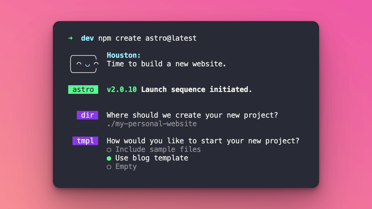
Astro has a CLI tool that will help you get up and running in seconds. Run the following command and follow the CLI wizard.
npm create astro@latest
After choosing the name or your project you will be given the choice to start with a boilerplate. Astro provides a boilerplate specific for a personal website. If you really want to learn the process of creating the right components I recommend you to do this all over again but with the default setup. This will require you to set everything from scratch. In this tutorial we will choose a personal website starter kit to get up and running with the foundation already in place.
After this you will get to answer a few more questions from the wizard. Choose what best suits you and your workflow. Astro uses TypeScript by default and I use the Strict mode. Use your preferred setup.
Project structure
Open the newly created project in Visual Studio Code and you have a nice folder structure setup.
To learn more details about each folder I recommend you to read the official documentation from Astro.
Go ahead and get familiar with the different folders and the project structure.
Adding Tailwind
To add Tailwind to your application I would recommend to use the quick installation with the astro add command. You can also add it manually and adjust the configuration files as you want. Read more about Astro integrations at the official documentation page.
Run the following command and follow the instructions.
npx astro add tailwind
Your astro.config.mjs should now look like this. We are importing tailwind from the @astrojs/tailwind package and adding it to the list of integrations.
import { defineConfig } from 'astro/config'
import mdx from '@astrojs/mdx'
import sitemap from '@astrojs/sitemap'

// https://astro.build/config
import tailwind from '@astrojs/tailwind'

// https://astro.build/config
export default defineConfig({
site: 'https://example.com',
integrations: [mdx(), sitemap(), tailwind()],
})
The installation helper also added a tailwind.config.js file that comes with a default setup.
/** @type {import('tailwindcss').Config} */
module.exports = {
	content: ['./src/**/*.{astro,html,js,jsx,md,mdx,svelte,ts,tsx,vue}'],
	theme: {
		extend: {},
	},
	plugins: [],
}
Now we can use Tailwind classes in all pages and components, regardless of framework.
Adding styling with Tailwind
Right now we have styling in /src/styles/global.css and inside some components with the <style> tags. When using Tailwind we could combine both regular CSS and Tailwind classes any way we want. In a larger project I would recommend to keep it consistent with one way of adding styles but for your personal website is not as crucial. Even though it looks nice when applied according to best practises.
Let’s create a new component and use Tailwind!
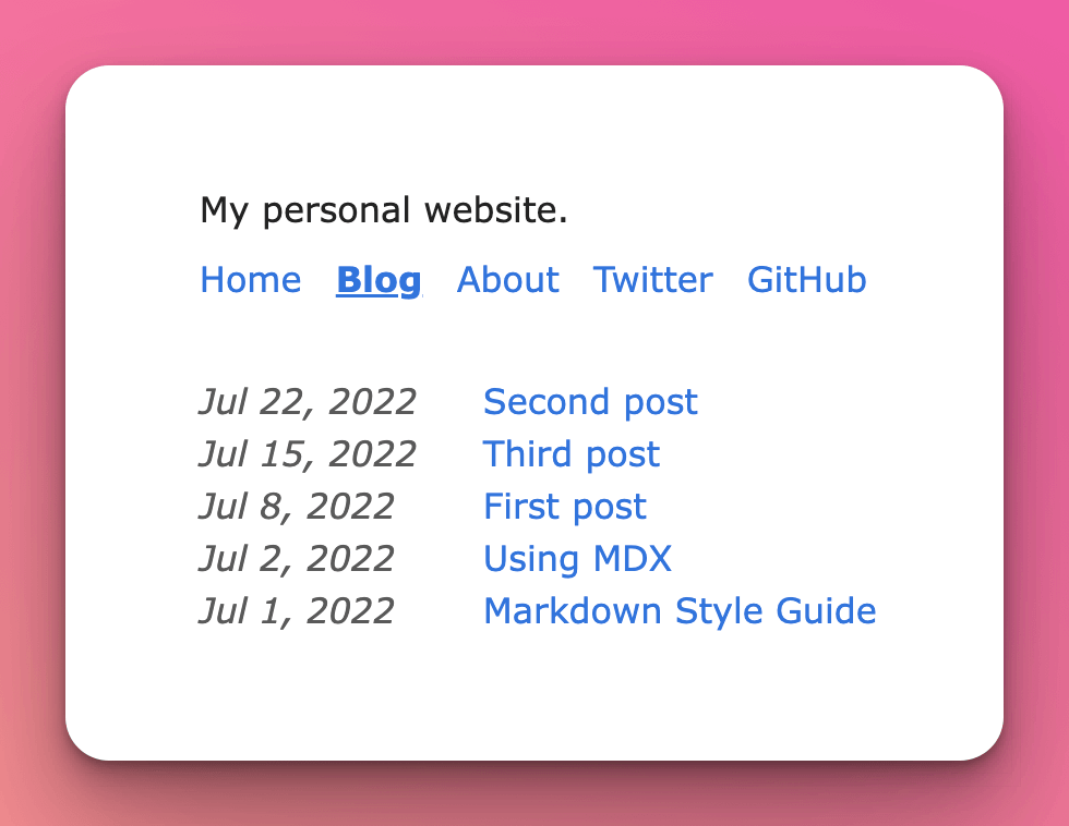
The default view of all posts looks quite boring right now. Let’s create a BlogPostCard component that we will use to list each blog post.
Creating a blog post card component
To get started create a file in the /components folder and name it BlogPostCard.astro.
Before adding styling lets create the building blocks of the component.
Since we’re using an .astro component we define things within the three dash --- syntax.
---

const { title, description, url, pubDate } = Astro.props;

const formattedDate = new Date(pubDate).toLocaleDateString();

---
For the card component we will use title, description, date and url from the blog post.
Add some basic markup.
---
const { title, description, url, pubDate } = Astro.props;

const formattedDate = new Date(pubDate).toLocaleDateString();
---

<li>
  <a href={url}>
    <time datetime={pubDate}>
      {formattedDate}
    </time>
    <h2>{title}</h2>
    <p>{description}</p>
  </a>
</li>
If we now head to /src/pages/blog.astro and add our newly created component.
import BlogPostCard from '../components/BlogPostCard.astro'
Then replace the <li> tags inside the map function with our new component.
<ul>
	{posts.map((post) => (
		<BlogPostCard
			title={post.frontpost.frontmatter.title}
			description={post.frontmatter.description}
			url={post.url}
			pubDate={post.frontmatter.pubDate}
		/>
	))}
</ul>
Now we are using the BlogPostCard component and having the correct data that we want. Let’s add some styling!
<li class="p-4 mb-10 transition bg-gray-100 border rounded-lg cursor-pointer hover:shadow-lg">
	<a class="text-black" href={url}>
		<time class="text-sm" datetime={pubDate}>
			{formattedDate}
		</time>
		<h2 class="py-2 text-lg font-bold">{title}</h2>
		<p class="pb-2">{description}</p>
	</a>
</li>
This makes the links to each blog post look a little bit nicer. Now it’s up to you to add the styles you want for the different pages and components. Hopefully you have a better understanding about the building blocks of an Astro project and how you can add Tailwind.
Adding styling to the blog post content
If you open /src/layouts/BlogPost.astro you will see the building blocks of a blog post page. Taking a look at what’s inside the main tag we see that first there’s some meta data about the post. Like title, image (if it exists), published date and updated date. At the end we see the most important part. The <slot /> tag. This is where the content from our blog posts will end up. The markdown content is parsed, turned into HTML and injected where the <slot /> is.
<main>
	<article>
		{heroImage && <img width={720} height={360} src={heroImage} alt="" />}
		<h1 class="title">{title}</h1>
		{pubDate && <time>{pubDate}</time>}
		{updatedDate && (
			<div>
				Last updated on <time>{updatedDate}</time>
			</div>
		)}
		<hr />
		<slot />
	</article>
</main>
But what if we want to add some specific styles to that content?
There is no way to add Tailwind classes to the different tags that the markdown produces. As everything in tech, this can be solved in multiple ways.
The easiest way is by targeting the different tags from your global stylesheet.
Open /src/styles/global.css.
This is where all your global styles are located. Adding styling to the h2 tag for example will add that styling to all h2’s on the site. If you are fine with that I would start adding the styling right here. Even if we can not add our Tailwind classes to the HTML elements we can use the @apply directive.
h2 {
  @apply font-bold text-lg pb-2 pt-4;
}
If we don’t want this styling to apply for all h2 on the site we could target only our blog post content.
How do we do that?
If we head back to our layout file and add a class to the <article> tag.
<article class="blog-content">...</article>
We could then target this class with our styling.
.blog-content h2 {
  @apply font-bold text-lg pb-2 pt-4;
}
Now we are only targeting the h2 tags that are inside our blog posts. Now you can target specific elements inside the blog post and apply the styling that you want.
Build and deploy
To build your Astro site it’s as simple as running npm run build. This creates a /dist folder with all the static files that is your website. You can see that all files in our /pages folder has turned into HTML files. Regardless of being a markdown or Astro file.
The deployment process is very straight forward as well. Use your favourite hosting service. I use both Netlify and Vercel but use the one you are most comfortable with. In hosting services like this you can either drag and drop your dist folder and in seconds you will have public site up and running. But when adding updates to your site this is very inefficient. I recommend you to put your project on GitHub and connect your GitHub account to the hosting service. Making it possible to trigger new builds every time you push new changes to your repository. The hosting services are also great at detecting what kind of framework you are using. And based on that adjust the deployment settings according to build commands and output folders.
Search Engine Optimisation
When having a personal website it’s interesting to see how many people that actually reads your articles. And that your site shows up in search results. For this to be possible you need to work with Search Engine Optimisation (SEO). In this article I will only briefly touch this subject and will show you how you can add some basic meta tags and a sitemap to your Astro site.
Adding meta data to your pages
If you navigate to /src/components/BaseHead.astro in your project, you will see this file.
---
// Import the global.css file here so that it is included on
// all pages through the use of the <BaseHead /> component.
import '../styles/global.css';

export interface Props {
	title: string;
	description: string;
	image?: string;
}

const { title, description, image = '/placeholder-social.jpg' } = Astro.props;

<!-- Global Metadata -->

<meta charset="utf-8" />
<meta name="viewport" content="width=device-width,initial-scale=1" />
<link rel="icon" type="image/svg+xml" href="/favicon.svg" />
<meta name="generator" content={Astro.generator} />

<!-- Primary Meta Tags -->

<title>{title}</title>
<meta name="title" content={title} />
<meta name="description" content={description} />

<!-- Open Graph / Facebook -->

<meta property="og:type" content="website" />
<meta property="og:url" content={Astro.url} />
<meta property="og:title" content={title} />
<meta property="og:description" content={description} />
<meta property="og:image" content={new URL(image, Astro.url)} />

<!-- Twitter -->

<meta property="twitter:card" content="summary_large_image" />
<meta property="twitter:url" content={Astro.url} />
<meta property="twitter:title" content={title} />
<meta property="twitter:description" content={description} />
<meta property="twitter:image" content={new URL(image, Astro.url)} />
This component is then used in all pages. Adding title, description and image based on page or article. This will ensure that the correct meta tags are being used for all pages. You could also set how your site should look like Twitter and Facebook with the og: and twitter: tags. The default configuration will work as is. Make sure to create a /placeholder-social.jpg image that will be used a the default preview image when sharing in social media. This can be changed for each page or blog post.
The default title and description is set in /src/config.ts.
Update these values as suits your project.
Adding a sitemap
The personal website template have the sitemap integration implemented by default. As you might have noticed the sitemap is listed under the integrations list in astro.config.mjs. When running the build script the sitemap integration will run last and create sitemap files that lists all pages in your application. There is nothing you need to think about unless you want to block some specific pages for example.
RSS feed
The template also adds a rss.xml.js file under the pages folder. This will create a RSS feed based on your site preferences and created pages. This is a nice thing to have but not anything crucial for a simple website like we’re building. To see what the package does you can run the build script and see the generated XML file in dist/rss.xml.
Summary
In this article you have learnt to use Astro and Tailwind to build your personal website. This is a great starting point. There are a lot of more advanced concepts that we did not cover. But this should get you started and hopefully inspired to write your own articles. I use both Astro and Tailwind on this site.
I hope you enjoyed it!